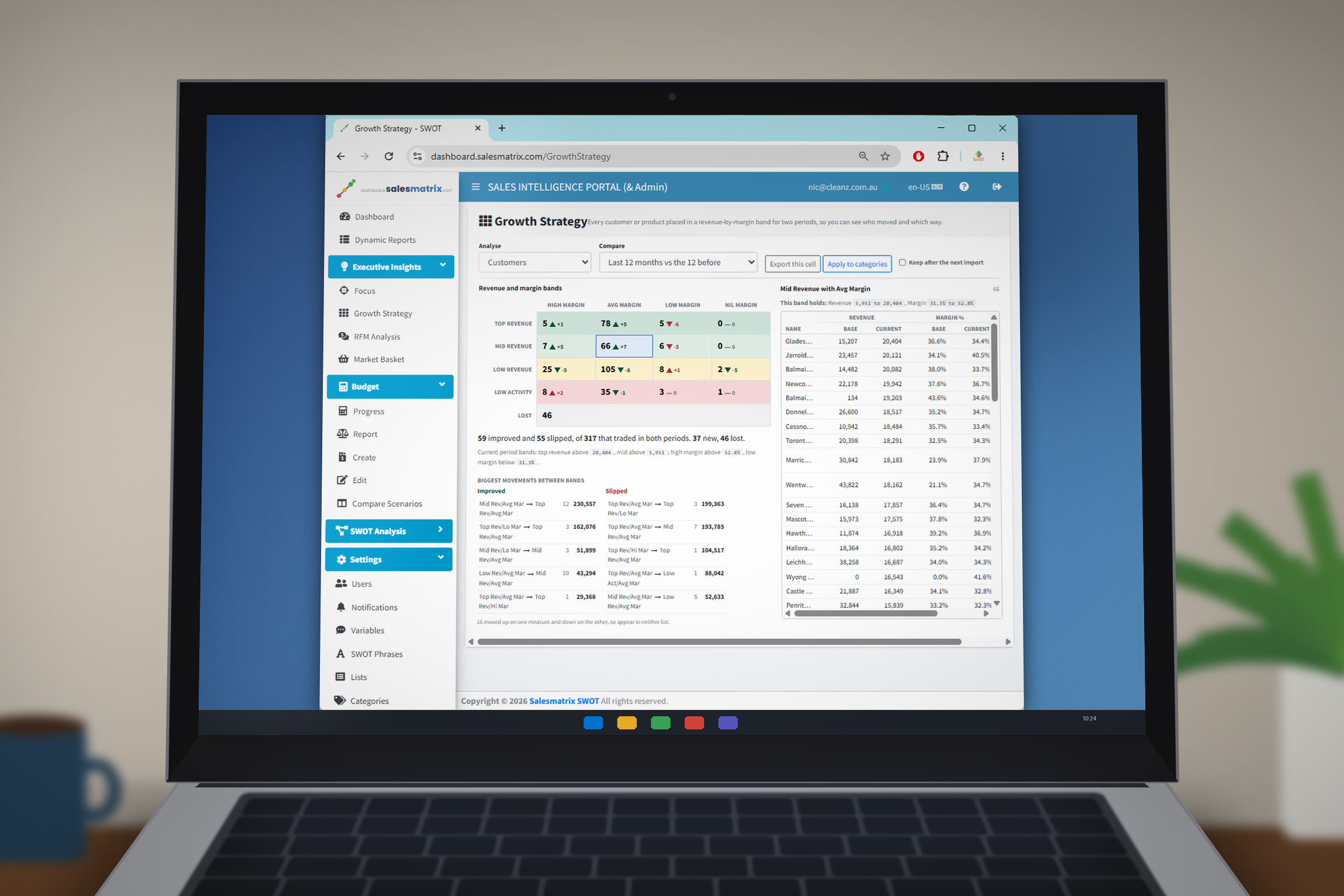
What has changed since the last live build. Two new reports, per-user access levels, a rebuilt side menu, and ready-made starting dashboards for sales reps.
New
Features that were not there before.
Growth Strategy New
Places every customer or product into a band by revenue and margin, for two periods at once, so you can see who moved and which way. Click any band to list what is in it, with each record labelled by what actually changed — +1 Revenue, −1 Margin, New or Lost.
Beneath the grid, two columns name the five largest movements in each direction, ranked by the revenue involved rather than by how many records moved. Results can be exported, or written back into category columns so the bands can be used as a report axis, a filter or a dashboard widget.
Executive Insights → Growth Strategy
Focus Report New
The 80/20 view: which customers and products account for the bulk of the business, and how long the tail is behind them.
Executive Insights → Focus
Access levels for each user New
Every login now carries an access level — Sales Rep, Manager or Administrator — set by an administrator on the Users page. The side menu shows only what that level can open, and the level is enforced when a page is requested, so a shared or bookmarked link will not let anyone past it.
Settings → Users
Rebuilt side menu New
The menu is now six groups — Dashboard, Dynamic Reports, Executive Insights, Budget, SWOT Analysis and Settings — each opening and closing on click, with your choices remembered between visits.
Starting dashboards for sales reps New
A rep signing in without a dashboard of their own is offered three ready-made layouts: My Day (where the month stands and what needs a call), My Territory (am I on track) and My Accounts (a call list). Choosing one makes it theirs to rearrange and save.
It can be changed later from Actions → Choose a starting layout, and each includes a favourites panel of territory-scoped reports.
Personal / Company toggle on more widgets New
Business Increases, Business Declines, New Business Sources, Stopped Business and Lapsed Products now carry the same Personal / Company switch the Top N and comparison widgets already had, so a rep can see their own territory rather than the whole company.
For these five the toggle decides which customers are listed; the figures beside each one remain that customer's whole-company totals.
Budget progress as KPI cards New
The budget-to-date widget can now be shown as cards instead of a grid — Revenue, Cost, Margin, Units and Margin %, each with month-to-date actual against the month goal and a variance arrow.
Improved
Things that already existed and now work better.
Category maintenance on a single page Improved
Naming the ten category columns, saying who maintains each one, and moving customers or products between groups are now all on one screen instead of two.
Settings → Categories
Only recently active records in category lists Improved
The lists now show customers and products that have traded in the last three years. Long-dormant records were burying the ones you are actually trying to group. Hidden records keep whatever group they are already in.
Reports use your own data permissions Improved
Widgets and reports now run under the signed-in user's own credentials rather than a shared account token, so any per-user restriction applies as intended.
Market Basket is translated Improved
The menu entry was previously English in every language. It now appears correctly in all eight supported languages.
Times recorded in UTC Improved
Timestamps written by the application are now consistent regardless of where the server or the user sits.
Fixed
Sign-in that half worked Fixed
A login whose company record could not be resolved used to succeed — the user reached a working dashboard, then hit “Session expired” on every report and settings screen, with nothing recorded to say why. Sign-in now fails properly and reports the real cause.
Dashboard widgets failing for sales reps Fixed
Business Increases and the other SWOT widgets showed “Failed to load data” for Sales Rep accounts. Fourteen widget data feeds were refused at the new access level; all now load.
Side menu arrows and colours Fixed
The Strengths, Weaknesses, Opportunities and Threats arrows pointed the same way whether the section was open or closed, and could leave the coloured section icons in a mixed state. A selected group heading also turned pale grey behind white text, making it unreadable; it is now teal.
Dynamic Reports label in other languages Fixed
A duplicated resource entry would have replaced the translated menu label with English. The original translations are intact.